By Ewurama GREENSLADE
Wow! I like the colour combination.
When you hear this expression in Ghana, they actually are referring to the excellent use of the 60-30-10 rule (most often).
Interior design is an art form that requires a delicate balance of colors, elements, and aesthetics to create visually captivating and harmonious compositions. One valuable tool is the 60-30-10 Rule, a principle that guides the distribution of colors in a design project. This rule, characterized by the distribution of colors in a design project, unveils a path to aesthetic equilibrium that effortlessly draws the eye.
Today, we embark on a journey to demystify the 60-30-10 Rule, delving into its essence, significance, and practical application. This is a rule that most of us use unconsciously and very easy to apply in our spaces.
Understanding the 60-30-10 Rule
The breakdown: 60% is the dominant color. This is the main color of your overall scheme, occupying most of the space. It typically sets the tone and mood of the design. Think of it as the foundation or backdrop.
30% is the secondary color: This plays a supporting role, adding interest and complexity to the palette. It should complement the dominant color but not overpower it. Imagine it as a bridge between the dominant and accent colors.
10% is the accent color: This is the star of the show, the pop of color that grabs attention and adds excitement. Use it sparingly, like a statement piece, to highlight key elements or create focal points.
This approach creates a sense of harmony and visual comfort in interior design, but the 60-30-10 rule is more than just a formula for aesthetic appeal. It serves a functional purpose, guiding the user’s eye through the interface, highlighting important elements, and creating a visual hierarchy. This intuitive navigation is what makes an interface not just usable, but enjoyable.
The impact of this rule extends beyond the individual user. It influences the overall user experience, affecting user engagement, satisfaction, and ultimately, the success of the design.
Example of areas to use the 60-30-10 rule:
Personally, I use 60% on walls, accent pieces, rugs, sofa (I use the colour wheel to assist me) Then 30% for curtains, table lamps and side chairs, and finally the 10% for throw pillows and decorative accessories.
Use the Color Wheel
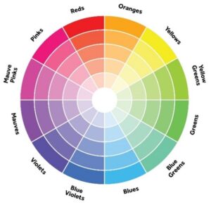
Another hack I found to make this process easy is by using the colour wheel. Most paint companies / shops have this available or on request. When looking for a place to start, select a main color and look at a color scheme based on the color wheel. Some strong options include complementary, monochromatic, or analogous colors.

- Analogous: Analogous colors are next to each other on the color wheel, like blue, green, and yellow. It usually works best if you choose the middle color (green) as your dominant color, with blue and yellow as supporting colors.
- Complementary: Colors that are opposite each other on the color wheel. This color scheme is usually two colors, for example, hues of purple and yellow. A third color often enters the mix, usually a color that is analogous or adjacent to one of the complementary colors on the color wheel; in this case, orange might provide a burst of color.
- Monochromatic: One color family keeps you within the boundaries of a monochromatic palette.
FAQ: Can i break the 60-30-10 rule?
Yes, if you’re feeling confident and rebellious, BUT know that you’re going to complicate things a little bit. You have three options with this:
- Score 110%: Add a fourth color to the mix by doing something like 60-30-10-10. This will be done by adding a second accent color in your accessories such as throw pillows, vases on shelves, picture frames, etc.
- Go completely monochromatic: Select ONE color and go wild and crazy from there by including several darker and lighter shades of that same color throughout your space. This can be done with wood tones as well. You may end up with an entirely gray room, but it will have dimension because of the variation of tones you use.
- Create your own formula: I always talk about Interior Styling and Home Decor being about how the space makes you feel. If you are feeling like you have an idea for colors, go with it! It may end up being something like 40-30-20-10 or 40-25-15-10-10 or even 75-15-10. Whatever the case, just make sure you horn in on your percentages, otherwise it may look wild and crazy!
Okay, that’s it! I know it may be confusing, but re-read this a few times, jot down some ideas and you’ll be on your way in no time! It is a very linear way to think about design, which sometimes can be so abstract. Just really stay on track and try to follow your percentages and you can’t go wrong!
I hope this gives you a good overview of the 60-30-10 color rule! If you have any further questions or want to discuss specific color palettes, contact me on Instagram – Decora Style. Can’t wait to hear from you!
And remember, the 60-30-10 rule is just a guide, not a hard and fast rule. You can adjust the percentages to achieve different effects, and it’s always important to choose colors you love and that work well together for your specific project.


